This post has been a long time coming; if you follow me on instagram you've probably seen quite a few snaps of our new kitchen anyway, I'm too impatient really to keep it all hush hush for a proper reveal post. But it hasn't featured on the blog before anyway, so I'm running with it.
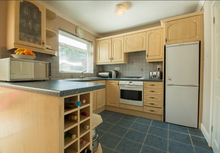
We lived with our hideous 1980s kitchen for almost three years before finally being in a position to renovate. It had laminate covered cabinets, that was cracked and peeling in too many places to count, inky blue worktops and floor tiles, paired with grey wall tiles with the odd horrendously kitsch cocktail glass design on.
Nice, right?
The angle and decent lighting are making it look better than what it was, but believe me, it was AWFUL.
So roll on three years and we met with a designer from Howdens to draw up some plans. I had originally wanted something grey and white, but the cabinets I chose only had 'antique white', a.k.a cream. We're lucky that most of what we wanted was available through Howdens, it was only the floor and walls tills that we had to look elsewhere.
Anyway, without further ado, here is our new kitchen!
Let's talk cabinets first; we went for the Fairford Graphite range, uhmming and aahing quite a bit about which colour combination to go with. We finally decided on graphite on the bottom with dove grey on the top, and I absolutely love the colours together.
We got a couple fancy extras like pull out recycling bins, and had a bit of a rearrange of the design to make sure we could fit in a dishwasher (PRAISE THE LORD) meaning a tiny bit of extra work for the plumber and electrician.
With grey cabinets we had to make sure the space wasn't going to be too dark, so we went white everywhere else. We went for the newest version of the grey and white marble laminate, which I think I prefer to the usual style. A big ceramic sink was also a must have for me, and we went for the Lamona ceramic single bowl sink, which I absolutely love, although now spend half my time cleaning it to keep it looking spotlessly clean!
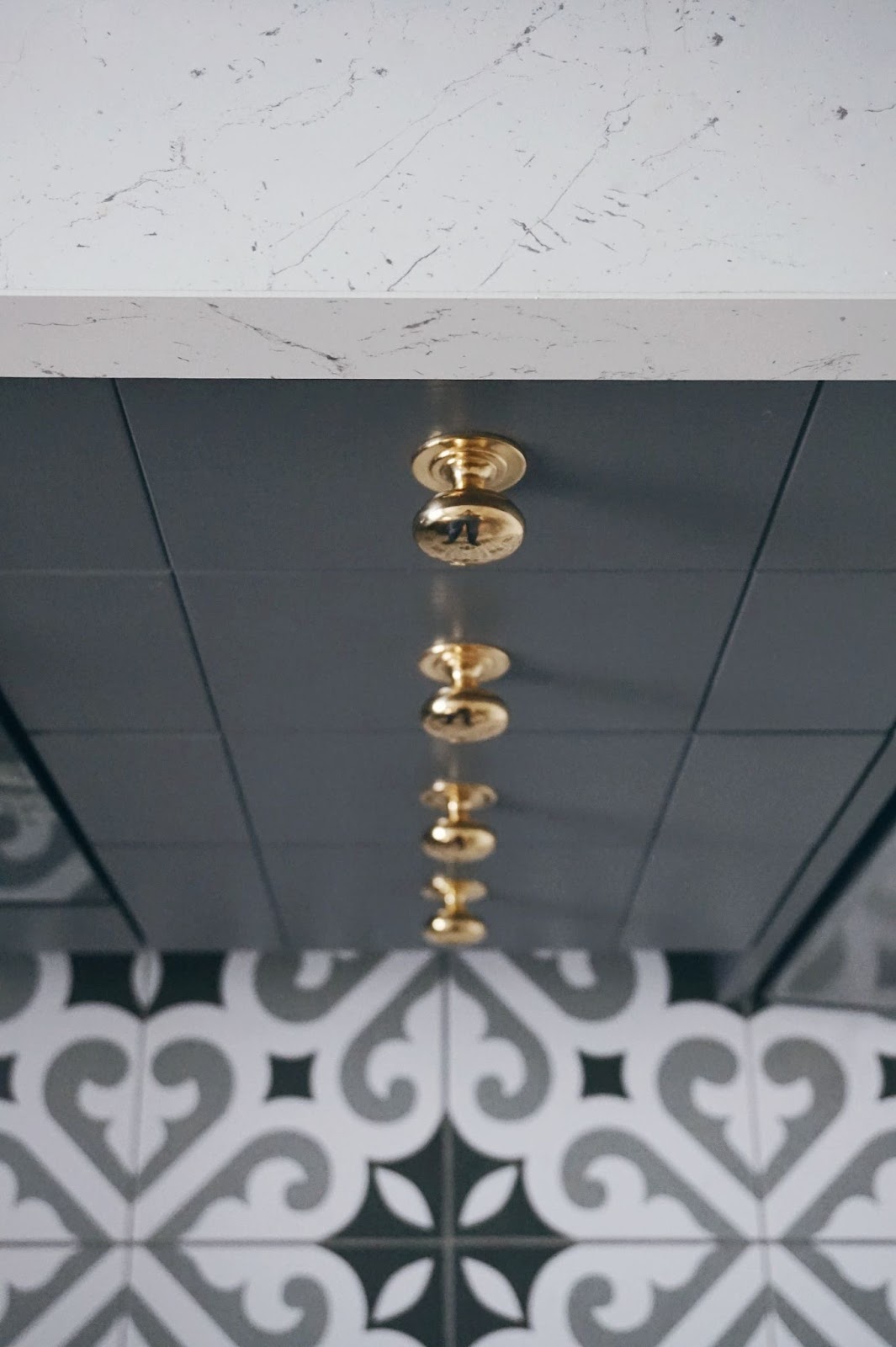
We went for the brass effect knobs as they were the only gold ones Howdens stock, and went for the Lamona brushed steel victorian swan neck tap, again as it was the only one they did that wasn't chrome.
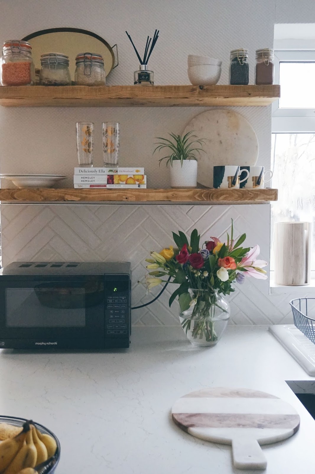
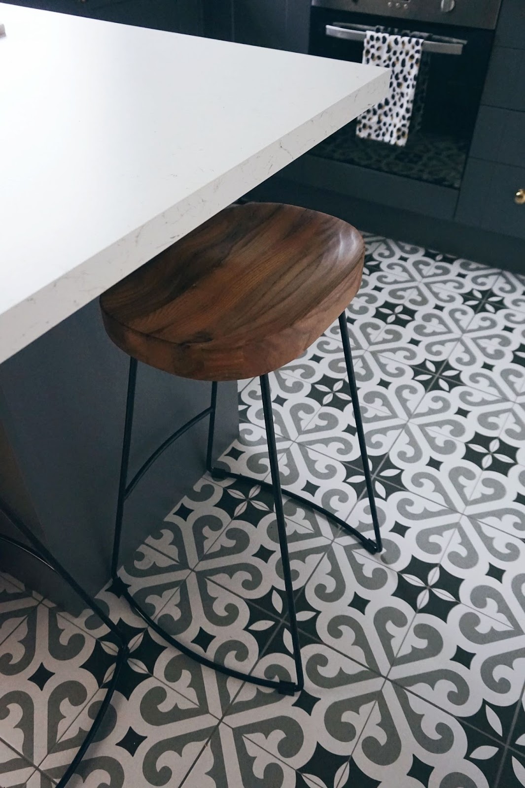
Moving onto tiles, and definitely one of my favourite parts of the kitchen! We went for the Thornbury tiles from Topps Tiles for the floor, which I absolutely looooove. I was worried they were a bit more suitable for a bathroom, but I think they work so well and it's the first thing people compliment when they've been the kitchen. Much to the delight of my tiler I had my heart set on a herringbone pattern, using the Artisau white gloss tiles. It took 2.5 days to do, but it was all so worth it (although I'm not sure if they would agree!)
Finally I wanted some wood touches to warm the space up a bit. I knew I wanted to leave a wall that originally had a cabinet attached free to attach some open shelving, and we found these rustic floating shelves on Ebay which were perfect. They tie in nicely with the industrial style bar stools from Cult Furniture.
So, that's it! It was a tough old month or so; spending two weeks with absolutely no kitchen, sink, washing machine or cooker wasn't fun, but it definitely was all worth it in the end! What do you think?








The floor tiles! The brass effect knobs! I'm loving what you've done with this space. It looks amazing.
ReplyDeleteThanks so much!
DeleteWhat a transformation!! It is such a gorgeous kitchen, I love love the colour scheme and the addition of rustic wood. Ceramic sink - ahhhh I want! :)
ReplyDeleteThank you :) the sink was a must have!
Delete